PPS Insurance
Project Details
- Project type : Website
- Client : PPS
- What I did : UI Design
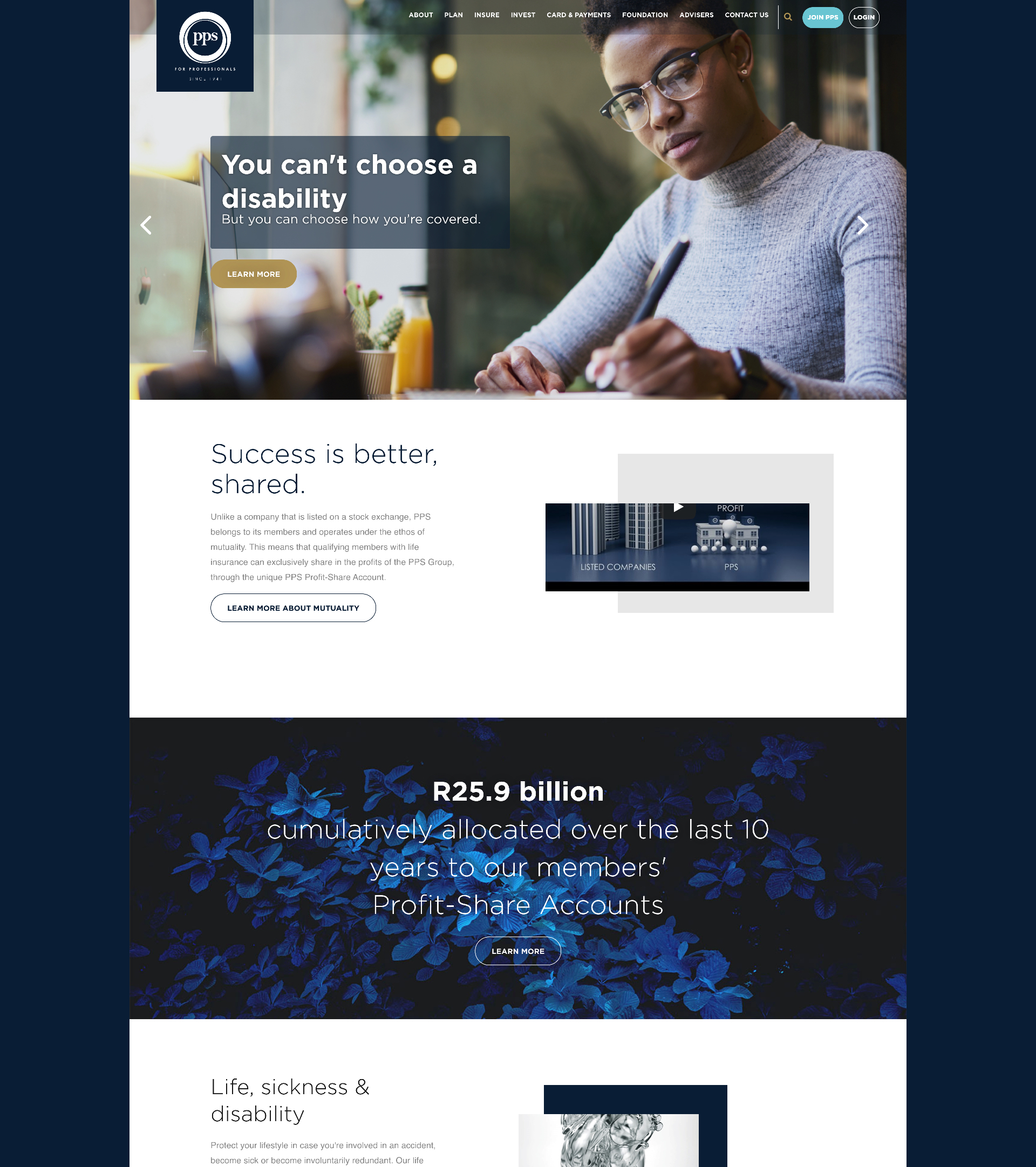
PPS was perceived as an old, institution, created for older, white men. Their design language and outdated website tended to support this misconception. They needed a refresh that would align with the companies new ideals and appeal to the younger, mostly black professionals.
I worked with a UX designer on this project and once the research was done I started designing the final screens in Sketch.
I was going for a fresh and less institutional feel and so I worked closely with PPS's brand team to introduce fresh, new colours to their palette. This, coupled with lots of white space a crisp, modern font and great imagery we manage to uplift their web presence and appeal to their new target market. We also simplified the registration and application processes and this has led to an increase in the number of applications they receive each month.